


This is an old revision of the document!
Chapter 8 - Product Setup
PRDOCUT SETUP
Product and Pricing Setup are the core functions that you will need to learn thoroughly. Most of the other items in this manual only need to be done once. Learn it, do it, forget it. For sure you will spend a lot of time in these area to build your site. It is quite likely that you will be revisiting these items frequently as you grow and refine your site. This chapter deals with setting up products. Whether you have just one product or an entire gamut, you should read through this chapter and full understand all the concepts to get the most out of the RealTimeDesigner.
CATEGORIES
MANAGING PRODUCT CATEGORIES
From the Admin Panel click on the PRODUCT SETUP > MANAGE/DEFINE PRODUCT
CATEGORIES link. A list of the current categories will appear. From this screen you can add new
categories, delete them and open existing ones for edits. Categories will help you manage your
products but they are most useful if you are using the RealTimeDesigner catalog. If you are using
some external source to launch the designer, categories become less important because you create any
needed navigation outside RealTimeDesigner and link directly to the chosen product.
ADDING A NEW PRODUCT CATEGORY
To add a new category fill in the Show Order field with a number if you have a preference on the sort order of the Categories. Give the new category a name in the Name field. The Super Category field is used if you want to create sub categories. Sub Categories are subordinate to the chosen Super Category. In the catalog, users will first be shown a list of categories. When they choose a category, they will then see a list of sub categories for the chosen category in a drill-down fashion. You are not limited in the number of levels you create in your catalog. Key factors in determining the level of categories and sub categories in your site will be the number of products you have and how they well they navigate for the end user. Once you've created your product categories, you will need to edit each to access the extended data associated with categories.
EDITING CATEGORIES
Clicking on the PRODUCT SETUP > MANAGE DEFINE PRODUCT CATEGORIES > EDIT buttons
will open a view of the category data displayed in the catalog. There are four fields to note on this
page. The Description is used to display a short bit of information about the category when in browse
category mode of the catalog. The Long Description is seen when users select that category. The same
hold true for the Image and Big Image. The Image is shown at the browse level; the Big Image is seen
when the users drill down to the category. Be sure to click the SAVE button once you've made changes
on this page.
MANAGING PRODUCTS
From the Admin Panel click on the PRODUCT SETUP > MANAGE/DEFINE PRODUCTS link. A
new screen will appear with a drop down list of all your product categories. Choose the appropriate
category from the list. A new list of the current products in that category will appear. From this screen
you can add new products, delete them, open existing ones for edits and also configure them. Edit
accesses the catalog display properties for that product whereas Configure is where you can access all
the definition variables used to set up the product for online design.
DECIDING BETWEEN NEW PRODUCTS AND OPTIONS FOR PRODUCTS
Often the products you offer will have countless variations. At some point you need interaction from your customers as to which options or variation they need. An example of this is Plastic Yard Signs - they might be available in 1 or 2 sided, with or without a frame. This could be set up all in 1 product, 2 products (1 sided or 2 sided), or 4 products (1 sided w/frame, 1 sided w/o frame, 2 sided w/frame, 2 sided w/o frame). There is no right or wrong way - choose whatever works best for your site. If you create specific links on your site to each of these options, your clients will have less to choose from once they enter the RealTimeDesigner. This prevents users from making mistakes but it also means they have to back up further if they chose the wrong option to begin with.
ADDING A NEW PRODUCT
To add a new product, using the top line of the table, fill in the Show Order field with a number if you have a preference on the sort order of the Products. Give the new product a name in the Name field. If you are working with products supplied by various manufacturers, use the Manufacturer field so that you will be reminded who supplies that product once an order comes in. The Hidden/Visible field is used to disable products from view by the customer. This is handy while developing new products on your site or when you wish to hide seasonal products. The External Catalog URL is where you enter the link for this product if you have created an external site and are not using the RealTimeDesigner catalog.
EDITING PRODUCT CATALOG PROPERTIES
Clicking on the PRODUCT SETUP > MANAGE DEFINE PRODUCTS > SELECT A CATEGORY >
EDIT buttons will open a view of the product catalog display data. There are four fields on this page
very similar to the Product Categories page. The Description is used to display a short bit of
information about the product when in browse category mode of the catalog. The Long Description is
seen when users select that product. The same hold true for the Image and Big Image. The Image is
shown at the browse level; the Big Image is seen when the users drill down to the product. The other
parts of this form are describe individually below. Be sure to click the SAVE button once you've made
changes on this page.
PRODUCT CATALOG LAUNCH OPTIONS
On the Product Edit screen, there is a frame titled Product Catalog Launch Options. The value selected here determines what options the end user is given when he selects a product in the Catalog. Enable Designer is the usual choice for your design online products. Enable Direct To Cart allows users to select a product and add it directly to his cart, without entering the designer. This allows you to develop a catalog which also includes non-personalized products such as frames for signs or stock printed Sale Banners. You can choose any combination of these values.
SPECIAL FORMATTING OF THE LONG DESCRIPTION
To the left of the Long Description text box is a button titled HELP FOR LIVE PRICING AND SPECIAL CODES. The catalog has some powerful features built into the Long Description Field that allows you to basically insert Variables in the description. These variables are then loaded at the time the page is displayed. This is great because you don't have to change the prices shown in your catalog - the prices are read directly from the product price configuration. Click on the HELP FOR LIVE PRICING AND SPECIAL CODES button to read more.
CLONE A NEW PRODUCT
You can quickly create new products with all the same settings as a current product by clicking the CLONE AS NEW PRODUCT button. To distinguish the original and new products apart, the new one will contain the word CLONE in its name. Just edit the name and any other necessary information and you have a new product available in your catalog. Use this feature whenever possible it will save you a lot of time.
CONFIGURING PRODUCTS
The RealTimeDesigner has a multitude of settings, each available on a product by product basis. You can have completely different settings based on each product. The configure button will give you access to a whole host of settings for your products. Click on the CONFIGURE button. A table of several links should appear. A brief description of each button is below. Each will be described in depth later.
- Configure Generator - which tools are available in designer
- Configure External Border - controls the area outside the design window
- Configure Background Colors - which colors to use for background
- Configure Colors - which colors to use for decorating
- Configure Defaults - default color and font settings
- Configure Fonts - which fonts are available
- Configure Clip arts - which clip art categories are available
- Disallowed General Templates - which template apply to this product
- Configure Product Configurator - allows configuration of options
- Configure Clip arts PPI - set resolution limits for user uploads
- Configure Sizes - what sizes the are available
- Configure Pricing Structure - access to all pricing controls
- Configure Pricing - access to pricing numbers only
- Clone Pricing Structure - tool to clone from one product to another


CONFIGURE GENERATOR
Clicking on the CONFIGURE GENERATOR link will display a control panel that resembles
something at NASA. Take a few seconds to read through the options - they should become self evident.
Basically, you can each and every tool in the designer on or off based on the need of the product and
the sophistication of your users. There is no one configuration that is right. Allowing your users more
control will be beneficial to some, but intimidating to others. Find the combination that works best for
your site. Please note that any tools identified with a (*) are not supported in the vector download. If
you enable these options which many users love, you will be required to download the image in bitmap
(SLOW) or you can recreate the effect offline in your desktop software.
“Allow moving items outside the design area” is the newest of the Configure Generator options. The creats an auto-clipping effect most useful for pushing a portion of a photo or clipart off the edge of the design. Previously you would be required to clip the image before using it in the designer. The image is prevented from being pushed completely off the design so that it does not become an unreachable orphan stranded in space.
CONFIGURE EXTERNAL BORDER
The external border is a feature that allows you to put a “picture frame” around the designer window.
This frame can be strictly visual or you can use the frame to include instructions. Frames are created as
eight separate images which piece together around the design window. The images are appropriately
named Upper-Left, Top, Upper-Right,
Left, Right, Bottom-Left, Bottom and Bottom-Right. The External Border is designed to grow and
shrink with the designer window size. The corner images never change, but the sides, top and bottom
images shrink and expand to fit the window. This allows one set of external border images to fit a wide
array of products in infinite size configurations. To add a new external border click the ADD A NEW BORDER button. You will be presented a screen
with 8 image upload boxes. Upload each image and save. It is important that the 8 images are properly
sized to fit together seamlessly. You will need to experiment with the pixel size best for you layout.
We suggest that you start with corner images 25×25 pixels.
To select a different border form the list of saved borders, use the pull down. A preview of the selected
border will be shown at the bottom of the screen.
To add a new external border click the ADD A NEW BORDER button. You will be presented a screen
with 8 image upload boxes. Upload each image and save. It is important that the 8 images are properly
sized to fit together seamlessly. You will need to experiment with the pixel size best for you layout.
We suggest that you start with corner images 25×25 pixels.
To select a different border form the list of saved borders, use the pull down. A preview of the selected
border will be shown at the bottom of the screen.
CONFIGURE BACKGROUND COLORS
In the RealTimeDesigner, the background color is selectable by the user if more than one color is offered to them. For a sign product, the background colors refer to the colors that the substrate is available in. For garments, the background colors refer to the shirt colors. In the COLOR GROUP pull-down, select the name of the color group you wish to apply for the background colors of the product. Color Groups are described in the Libraries chapter. An alternative to using color groups is to assign colors directly from the color list. This is not recommended as maintenance down the road can be more time consuming. If you use color groups and a new color is added or a color is deleted, you will only need to make changes in one single place in the library group. If you assign colors directly at the product level, you will need to change every product individually. The Background Color Image file upload area allows you to insert a small thumbnail image that will be used to display product mockups instead of square color swatches for the background color. The background color will be displayed in the transparent areas of the image.
CONFIGURE COLORS
In the RealTimeDesigner, the color is selectable by the user if more than one color is offered to them. Color refers to the color choices given to the user for text, artwork and shapes used in their designs. In the COLOR GROUP pull-down, select the name of the color group you wish to apply for the decoration colors of the product. Color Groups are described in the Libraries chapter. An alternative to using color groups is to assign colors directly from the color list. This is not recommended as maintenance down the road can be more time consuming. If you use color groups and a new color is added or a color is deleted, you will only need to make changes in one single place in the library group. If you assign colors directly at the product level, you will need to change every product individually.
CONFIGURE DEFAULTS
The Configure Defaults screen is fairly simple. Simply select the default values you wish the used to
be given as defaults. He will be able to edit the items once created. We recommend that you set the
default color to black, background color to white, shapes color to black and the other colors to
transparent. Save your settings and experiment to see if this works best for you.
CONFIGURE FONTS
The lettering font is selectable by the user if more than one color is offered to them. In the FONT GROUP pull-down, select the name of the font group you wish to apply for the lettering on the product. Font Groups are described in the Libraries chapter. An alternative to using font groups is to assign fonts directly from the font list. This is not recommended as maintenance down the road can be more time consuming. If you use font groups and a new font is added or a font is deleted, you will only need to make changes in one single place in the library group. If you assign fonts directly at the product level, you will need to change every product individually. }
CONFIGURE CLIPARTS
Configure Clip art refers to the categories of the clip art that are displayed for each product. In the CLIPART GROUP pull-down, select the name of the clip art group you wish to apply for the product. Clip art Groups are described in the Libraries chapter. An alternative to using clip art groups is to assign clip art categories directly from the category list. This is not recommended as maintenance down the road can be more time consuming. If you use clip art groups and a new category is added or a category is deleted, you will only need to make changes in one single place in the library group. If you assign clip art categories directly at the product level, you will need to change every product individually.
DISALLOWED GENERAL TEMPLATES
By default, all templates categories are available to all products. Use the DISSALLOW feature to hide any template categories that don't apply to the product. Remember, all templates categories will be displayed for the product unless you turn them off on this screen. CONFIGURE PRODUCT CONFIGURATOR Developed for a large national screen printer, this feature allows you to configure options that follow the if-then-else structure. This is a very specialized tool that warrants its own chapter later in this manual. Check out the product configurator if the Pricing Add-ons don't accomplish what you need.
CONFIGURE CLIPARTS PPI
You can control what resolution is allowed for user uploaded artwork. Resolution is measured in PPI -
pixels per inch. This is done by setting breakpoints. When a clip art falls within the breakpoints range,
the appropriate message is displayed. You can set several breakpoints to alert users that their artwork is
fair quality, poor quality or totally unusable.
CONFIGURE SIZES
The Configure Size routine in the RealTimeDesigner is very powerful and probably the most complex
routine in the system. Mastering this routine will make the rest of the RealTimeDesigner setup seem
easy.
The RealTimeDesigner works with two basic size models- FIXED SIZE and RANGED SIZE. The size
refers to the product size. Business cards, coffee mugs, and yard signs are fixed size products. A
product can have more than one fixed size, but there is a definite limit to the number of sizes offered.
Things like banners that can be made any size fall in the ranged size model. Basically, if you will be
offering a limited number of sizes that the user will pick his size from a single list, use fixed sizes. If
the product would be better served with the user selecting the height and width separately, use ranged
size.
When you load the Configure Sizes screen you will be on the General Page. Notice the three links
labeled GENERAL - RANGED SIZES - FIXED SIZES. These links allow you to move between the
two size models. Although you can set up both fixed and ranged for a product, only the radio button
value on the General Screen setting “SIZE MODEL TO USE” will apply.
DEFINING A RANGED SIZE
From the CONFIGURE SIZES screen click on RANGED SIZES. A table will load on the bottom of the screen. For Ranged Sizes, you can only enter 1 size range. A description of each column is below.
- W start - the smallest width allowed for the product
- W end - the largest width allowed for the product
- W step - the increment value used to populate the width pull-down
- H start - the smallest height allowed for the product
- H end - the largest height allowed for the product
- H step - the increment value used to populate the height pull-down
- W default - the initial width value presented to user
- H default - the initial height value presented to user
- Max W in designer - pixel width of designer window
- Max H in designer - pixel height of designer window
- Part Number - use this field as needed
- 1 in² Weight - the weight of this product if W=1 and H=1
- Enable coord switch - landscape/portrait swap


RANGED SIZE BACKGROUND PREFERENCES
At the right of the Ranged Size table are UPDATE, BACKGROUND PREFERENCES and CATALOG IMAGE buttons. The Background Preferences button leads to a page with the following controls:
- Show the entire “border” control
- Shapetype to use
- Rounded Rect Circle/Ellipse
- Show/Hide border option
- Horizontal Corner Radius
- Vertical Corner Radius
- Fill Color
- Stroke Color
- Stroke Width
- Edge Offset


These Background Preference controls are designed for very specific purposes and likely will not be used with many of your products. Experiment with them to see how they affect your product designer window. Their most useful purpose is to configure round or oval products within the rectangular designer window.
RANGED SIZES CATALOG IMAGE
The Catalog Image button opens a familiar screen where you can upload an image and text or HTML description for the catalog if you are making use of the catalog.
DEFINING A FIXED SIZE
From the CONFIGURE SIZES screen click on FIXED SIZES. A table will load on the bottom of the screen. You can have more than one fixed size option for each product. A description of each column is below.
- Direct Link - gives you a designer link to this size for this product
- Default - which fixed size is the default
- Width - width in your selected units
- Height - height in your selected units
- Size Override - Override value read by pricing matrix
- Max W in designer - pixel width of designer window
- Max H in designer - pixel height of designer window
- Name to show - if used, will be displayed in designer
- Show Order - controls sort order of display
- Sides - the number of sides that this product has
- Part Number - use this however you wish
- Weight - weight of one of these
- Enable coord switch - landscape/portrait swap


At the right of the Fixed Size table are UPDATE, REMOVE and CLONE buttons. Be sure to click the update for each size before editing another line.
VIEW FIXED SIZES EXTRA OPTIONS BUTTON
Fixed sizes have an extensive list of options not available to ranged sizes. Just above the Fixed Sizes
definition table is a button labeled FIXED SIZES EXTRA OPTIONS. Clicking this button will reveal
a new screen with several buttons. These buttons lead to controls for each fixed size including
background images, multiple sides options and catalog images.
FIXED SIZES REFERENCE FILES
You can store a file with each fixed size entry. This is included for an original artwork file to be stored in the system, but can be used to store any file related to the product. The Reference File upload is located on the VIEW FIXED SIZES EXTRA OPTIONS screen.
FIXED SIZES CATALOG IMAGE
The Catalog Image button opens a familiar screen where you can upload an image and text or HTML description for the catalog if you are making use of the catalog.
FIXED SIZE BACKGROUND PREFERENCES
The Background Preferences button is located on the VIEW FIXED SIZES EXTRA OPTIONS screen. The Background Preferences button leads to a page with the following controls:
- Show the entire “border” control
- Shapetype to use
- Rounded Rect Circle/Ellipse
- Show/Hide border option
- Horizontal Corner Radius
- Vertical Corner Radius
- Fill Color
- Stroke Color
- Stroke Width
- Edge Offset


These Background Preference controls are seldom used but available should you need them. Experiment with them to see how they affect your product designer window. Their most useful purpose is to configure round or oval products within the rectangular designer window.
BACKGROUND COLORS NOT AVAILABLE
The top portion of the Background Preferences screen is titled “Background Colors Not Available”.
You can select individual colors from the list of background colors that are NOT available in this
particular fixed size. This feature is most used in the textile industry to account of limited numbers of
colors in the very large sizes. If your 5X shirts are only available in white, black and gray, you would
place check marks next to all the other colors for that brand of shirt.
FIXED SIZE SIDES PREFERENCES
The Sides Preferences button is located on the VIEW FIXED SIZES EXTRA OPTIONS screen. The
Sides Preferences is linked to the number of sides you declared when you created the fixed size for the
product. You will have one screen frame devoted to each side that was define. Each screen frame has
fields very similar to those present when you declared the fixed size - height, width, etc. Each side can
be a unique size. Imagine your product being a custom printed shoe box. Each of the six sides would
have different sizes. Each of the Fixed Sizes Sides Preferences screen frames also have some tools
we've not seen before - Background Images, Foreground Images and Margins.
FIXED SIZES BACKGROUND AND FOREGROUND IMAGES
One of the favorite tools for customizing the designer is the ability to place Background and Foreground Images into the designer window. This is the place where you would insert a picture of a blank shirt so that users could decorate on top of it. The background and foreground images work the same, except they are layered within the designer window. The lowest layer in the designer window is the background color. Next the Background image is drawn. The end users drawing elements are drawn over the background color and the background image. Finally, the foreground image is drawn. Background and foreground images will yield the best results if they are created in the exact pixel size as your designer window uses.
TRANSPARENCY IN BACKGROUND AND FOREGROUND IMAGES
Because of the way the all the images are layered, the background color can only be seen if your background image contains transparency as is available in GIF and PNG formats. If the background image contains no transparency, you will see no effect when changing background colors. Similarly, If your foreground image does not contain transparency, the end user will not see their design, the background image or the background color. If you are not familiar with image transparency, search the web for “PHOTOSHOP TRANSPARENT IMAGE” or similar, depending on the drawing program you use.
FIXED SIZES MARGINS
Also located on the VIEW FIXED SIZES EXTRA OPTIONS > SIDES PREFERENCES screen are tools for Margins. Margins are used to confine the drawing area to only a portion of the designer window. For instance, you wouldn't want your client placing lettering which flows over an area bigger than the shirt itself. There are a few ways to enter margins. You can enter margin values for left, right, top and bottom. If your designer contains a 2×3.5 business card and you want to maintain a 0/25 margin for all text, set all margin values to 0.25. You can also use the Interactive Margin Tool. With this tool, you use your mouse to set the margins visually rather than entering numbers.
MULTI BACKGROUND IMAGE PREFERENCES
The Multi Background Image Preferences button on the VIEW FIXED SIZES EXTRA OPTIONS
screen is used to load various background images that will override the use of background colors. This
legacy tool was a great use before the advent of transparent images, but it is still used. Picture a line of
printed shirts with various color stripes. The background color would not sufficiently show the
variations of the shirts. Instead you could upload an image of each and every color combination using
the MULTI BACKGROUND IMAGE PREFERENCES tool.
PRODUCT LIST EXPORT
If you have a need for a complete list of the product names within your site, use the “RAW PRODUCTS LIST” located in the Admin Panel. A text file will be generated that you can copy.
CREATE PRODUCT WIZARD
Many of the above steps have been combined into a wizard to make the process easier for those not so familiar with navigation of the RealTimeDesigner Admin Panel. Click PRODUCT OPTIONS > CREATE PRODUCT WIZARD to display the following screen.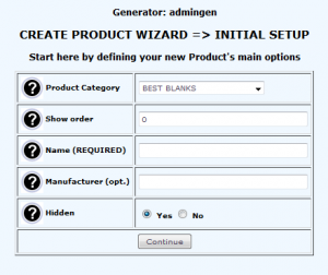